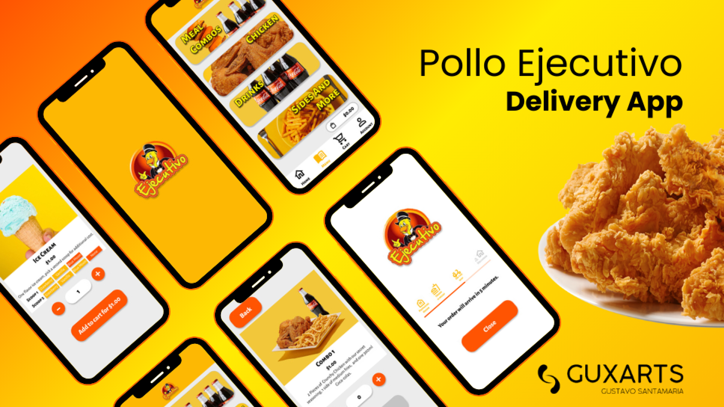
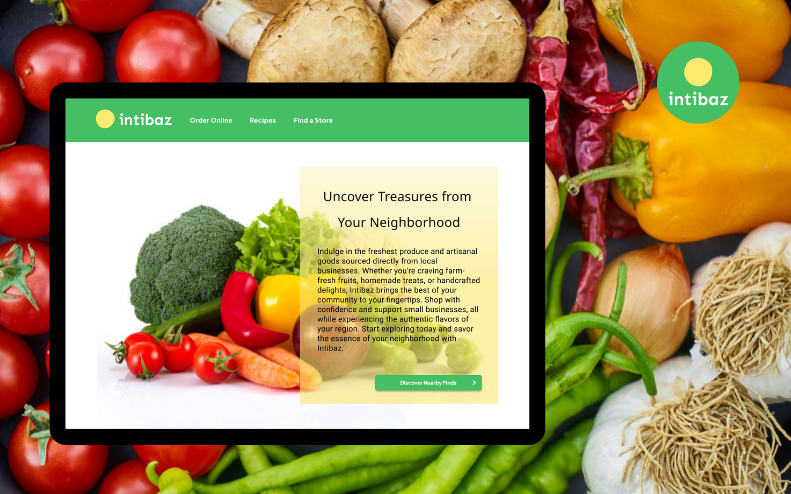
Order anytime, anywhere: delivery or pickup, it's all in our app.
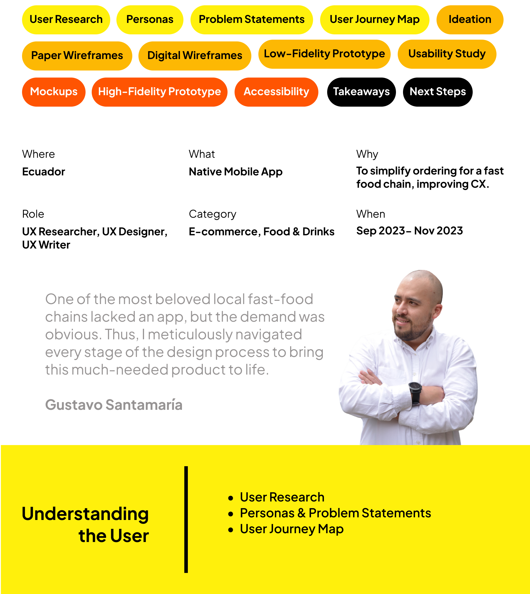
User Research
Summary
To design an essential app for a beloved local fast-food chain, my initial step was to define clear interview goals focused on understanding the use of food delivery apps. Subsequently, I conducted a screener survey through social media to recruit suitable family or friends as research participants.
After identifying participants, I emailed them an introduction to the project along with a consent form and, upon confirmation of their participation, scheduled interviews. After crafting a script aligned with the interview goals, I conducted recorded interviews, enabling me to entirely focus, empathize with the users, build rapport, and ask pertinent follow-up questions.
Post-interview, I reviewed the recordings, completed questionnaires, and created empathy maps for each participant. Analyzing the insights garnered, I identified key pain points and developed two personas representative of diverse demographics. These personas were a foundation for guiding the subsequent stages of app design, ensuring a user-centric approach.
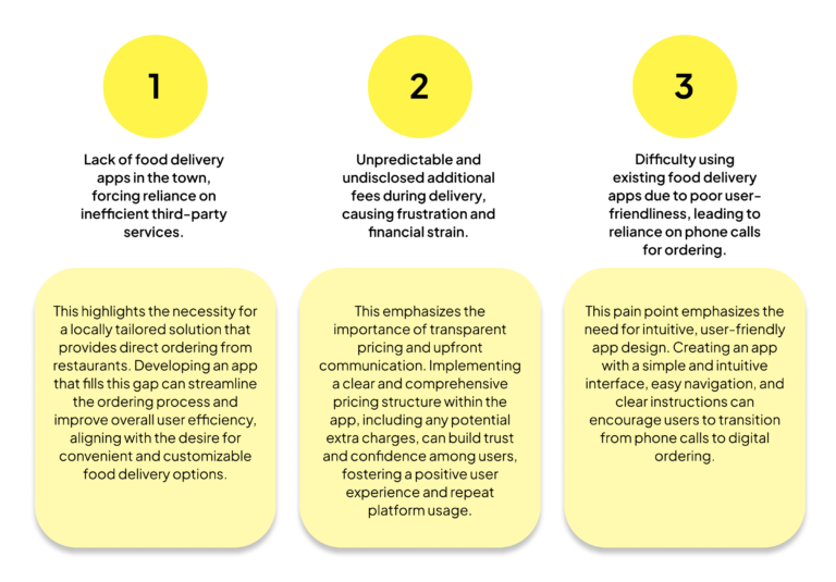
Pain Points
As the journey unfolds for individuals seeking convenient meal solutions, common frustrations emerge, highlighting the following pivotal pain points in their user experience:
Personas & Problem Statements
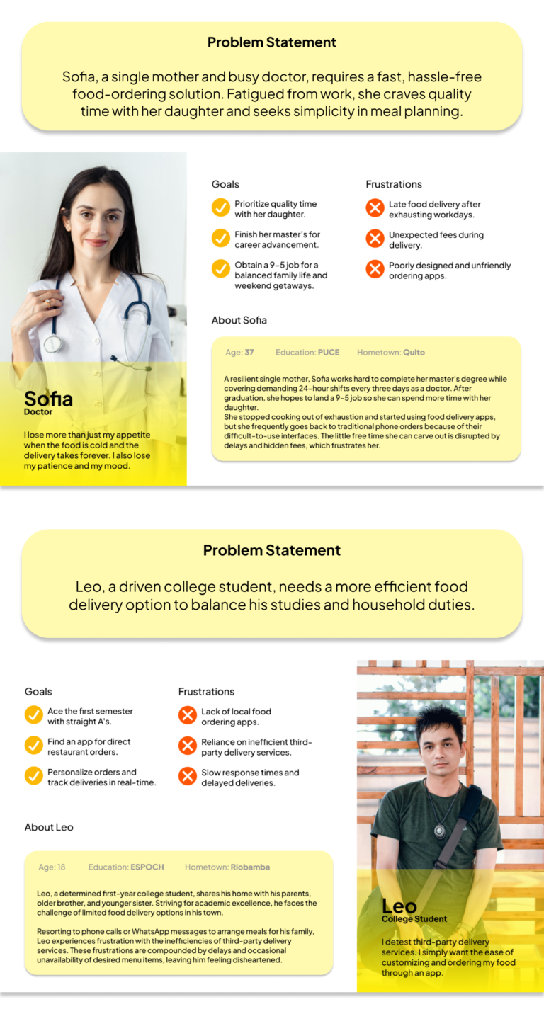
From the insights gained through interviews, two distinct personas emerged: a committed single mother balancing work, school, and family life and an ambitious college student seeking efficient food ordering solutions.
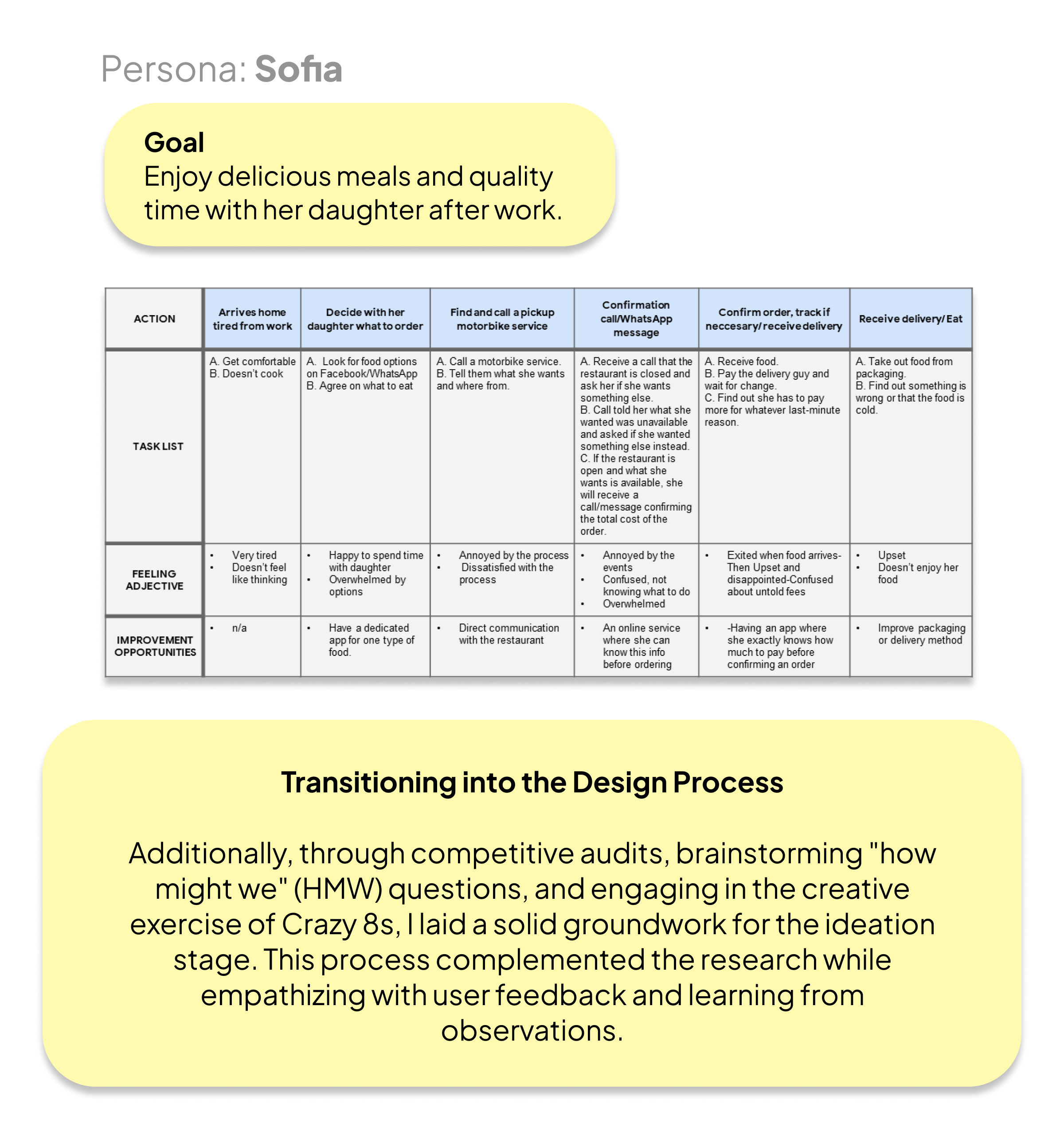
User Journey Map
For the user journey map, I focused on Sofia, whom I identified as the least tech-savvy persona. Through Sofia’s journey, I aimed to explore the unique challenges and opportunities faced by users who may have encountered barriers when interacting with digital platforms. This approach provided valuable insights for designing more inclusive and accessible solutions.
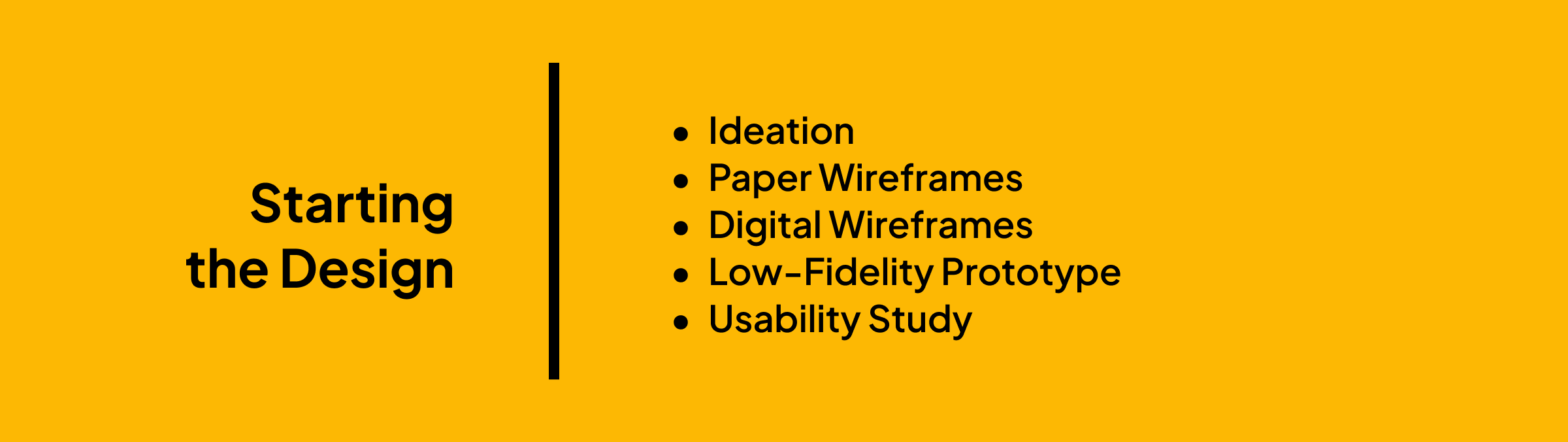
Ideation
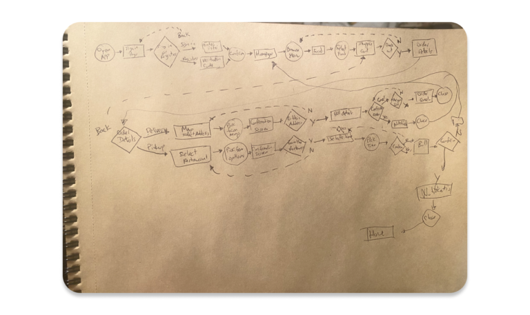
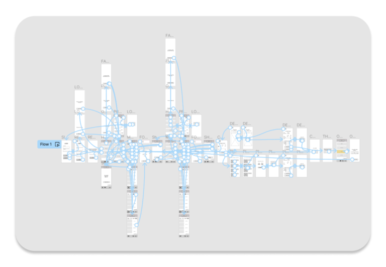
User Flow
I transitioned into the ideation phase by sketching out a user flow. The user flow helped me anticipate user interactions and streamline the navigation process. This step was instrumental in ensuring my designs were user-centric, effectively addressing their needs and preferences.
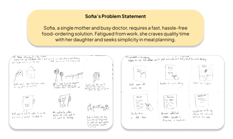
<span data-metadata=""><span data-buffer="">Story Boards: Big-Picture and Close-Up
By crafting both a big-picture storyboard and a close-up storyboard, I aimed to gain a comprehensive understanding of Sofia’s experience within the app. This approach allowed me to empathize with her journey and facilitated identifying and resolving potential pain points and challenges throughout the design process.
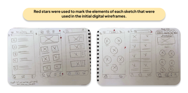
Paper Wireframes
After completing the user flow and storyboards, I sketched the wireframes. Drafting the interactions of each app screen on paper ensured that the elements that made it to the digital wireframes would be well-suited to address user pain points.
I prioritized a quick and easy ordering process for the home screen to help users save valuable time. This meticulous approach allowed me to craft wireframes that addressed Sofia’s needs and provided a seamless and intuitive user experience throughout the app.
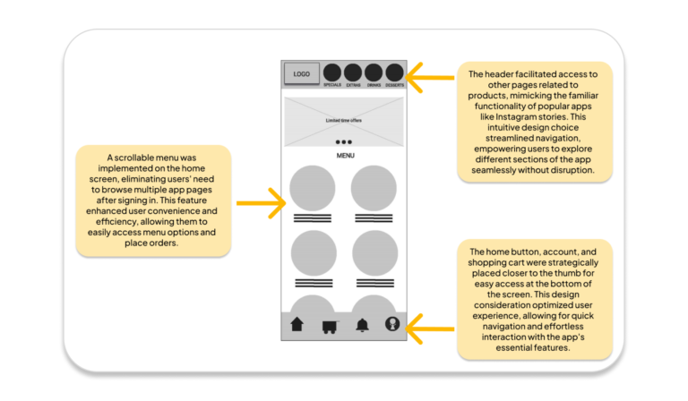
As the initial design phase progressed, I meticulously crafted screen designs based on feedback and findings from user research.
Prioritizing ease of navigation was crucial, as they closely aligned with the user needs that were identified during the research phase. These factors, which were integrated into the wireframes and prototypes, ultimately shaped the user-centric and inclusive design of the food delivery app.
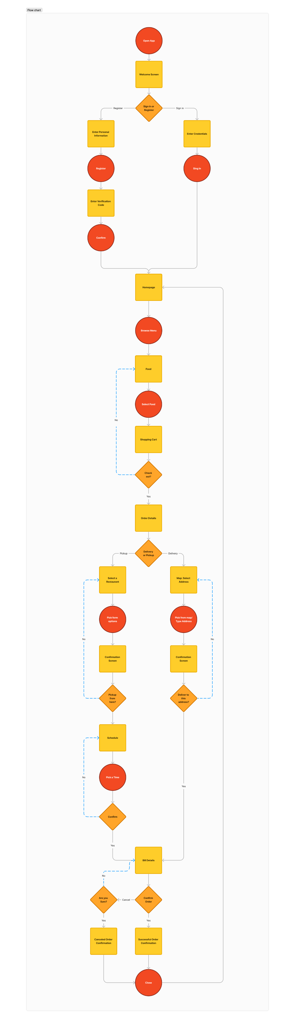
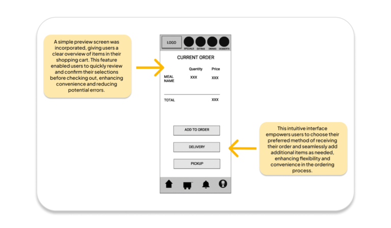
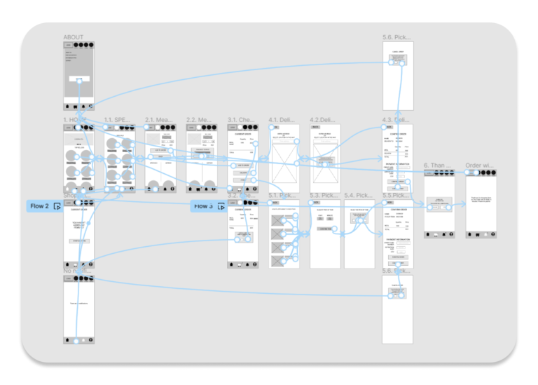
The low-fidelity prototype, which has a simple layout and functionalities, displays the early design concepts for the delivery app. The user flow describes how users browse menus, place orders, and move between the app’s different sections.
Users are taken to a confirmation screen where they can check the details of their order after placing one. Then, they are asked to choose between delivery and pickup as their preferred delivery option. After selecting, the user has one more chance to confirm their order’s accuracy and ensure no additional costs or inconsistencies.
This prototype provides a framework for future development by enabling stakeholders to see the application’s structure and offer suggestions for improvement.
Usability Study
Summary
I conducted the study via Zoom. Before the session, I sent emails to schedule the studies and attached a consent form for participants to sign, allowing me to record the session for more detailed observation.
During the study, participants were given four tasks to complete. I asked them to complete the study aloud, explaining their thought processes for their actions, describing how they felt, and mentioning any options they had while completing the tasks.
Later, I rewatched the session to take notes on their click path, behaviors, opinions, and attitudes, noting any errors, issues, or areas of confusion. Additionally, I recorded significant quotes to gather insights into their experience with the product.
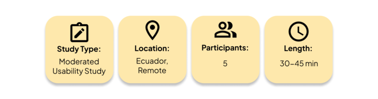
Parameters
Affinity Diagrams
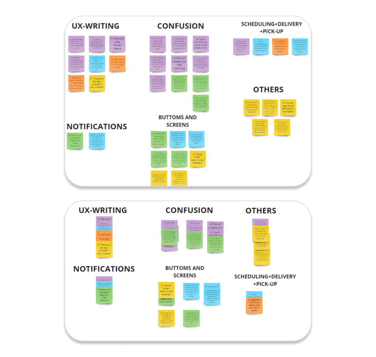
I organized the data recorded in the Excel spreadsheet from the usability study into affinity diagrams. These diagrams helped me categorize and visualize the insights and findings from the studies, allowing for a better understanding of user behaviors, preferences, and pain points.
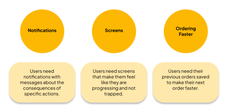
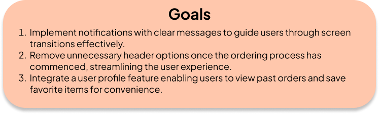
Insights
The following insights were obtained from the study:
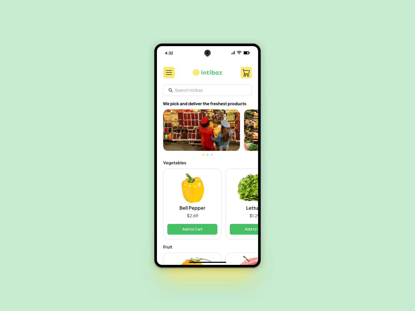
Mockups
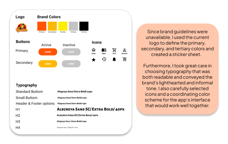
Following the low-fidelity prototype’s refinement, I created a high-fidelity prototype that included every screen. Nevertheless, I had to overcome the difficulty of establishing the app’s visual identity before beginning the design process.
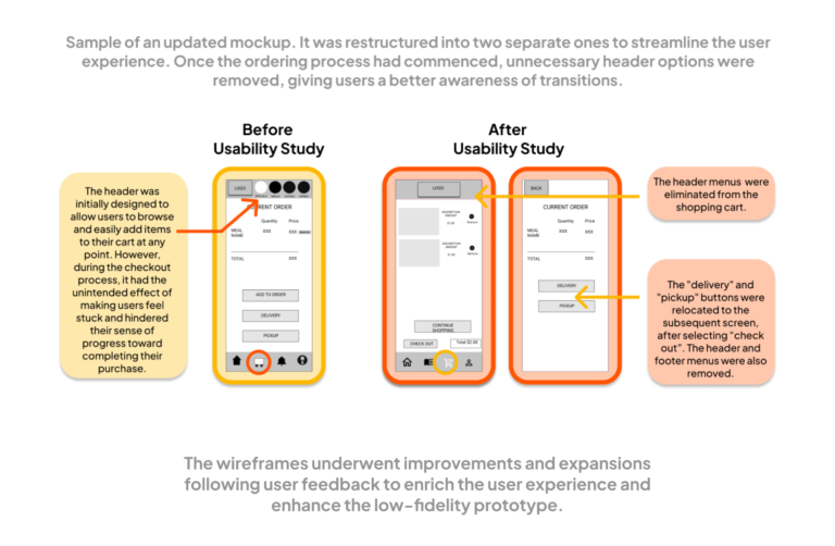
Updated Low-Fidelity Prototype
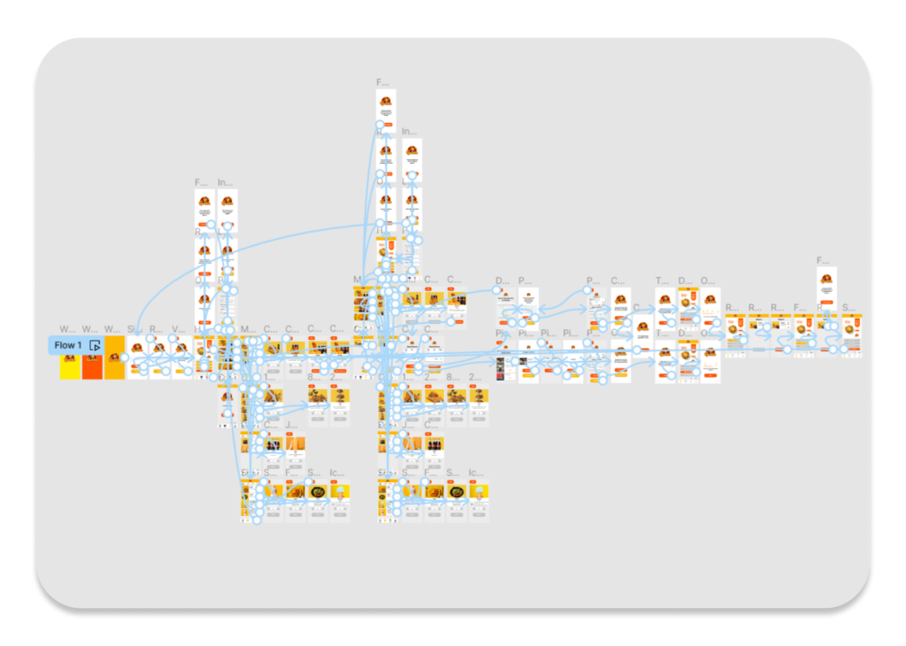
High-Fidelity Prototype
Following the low-fidelity prototype’s refinement, I created a high-fidelity prototype that included every screen. Nevertheless, I had to overcome the difficulty of establishing the app’s visual identity before beginning the design process.
Sticker Sheet
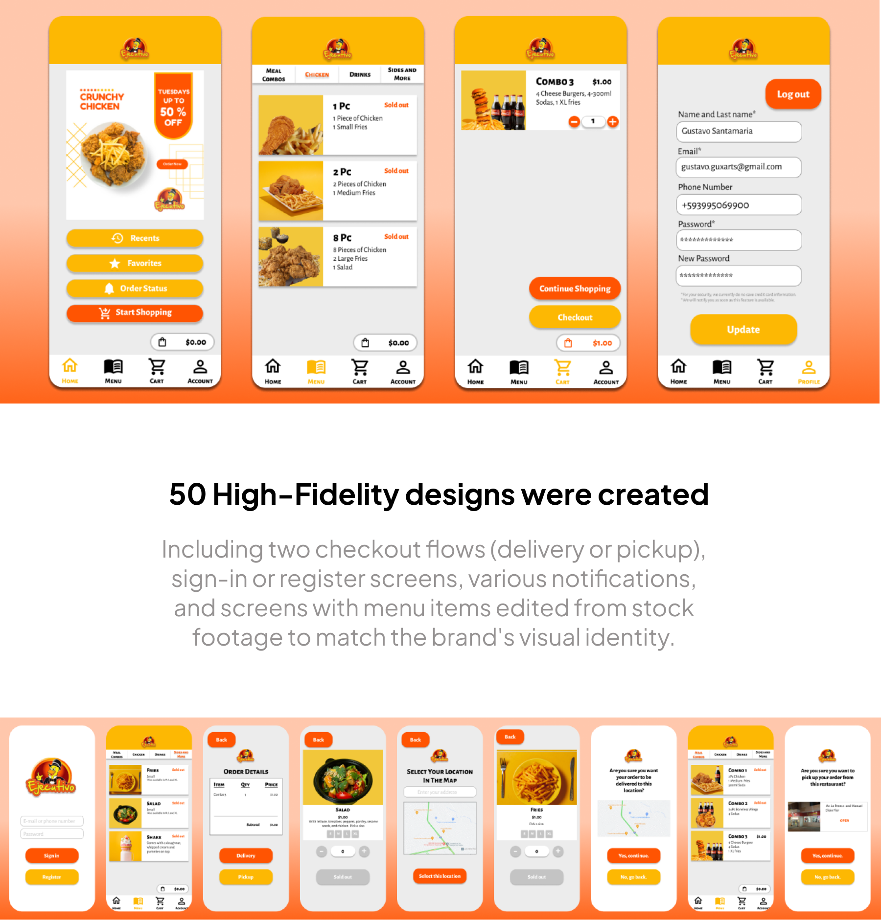
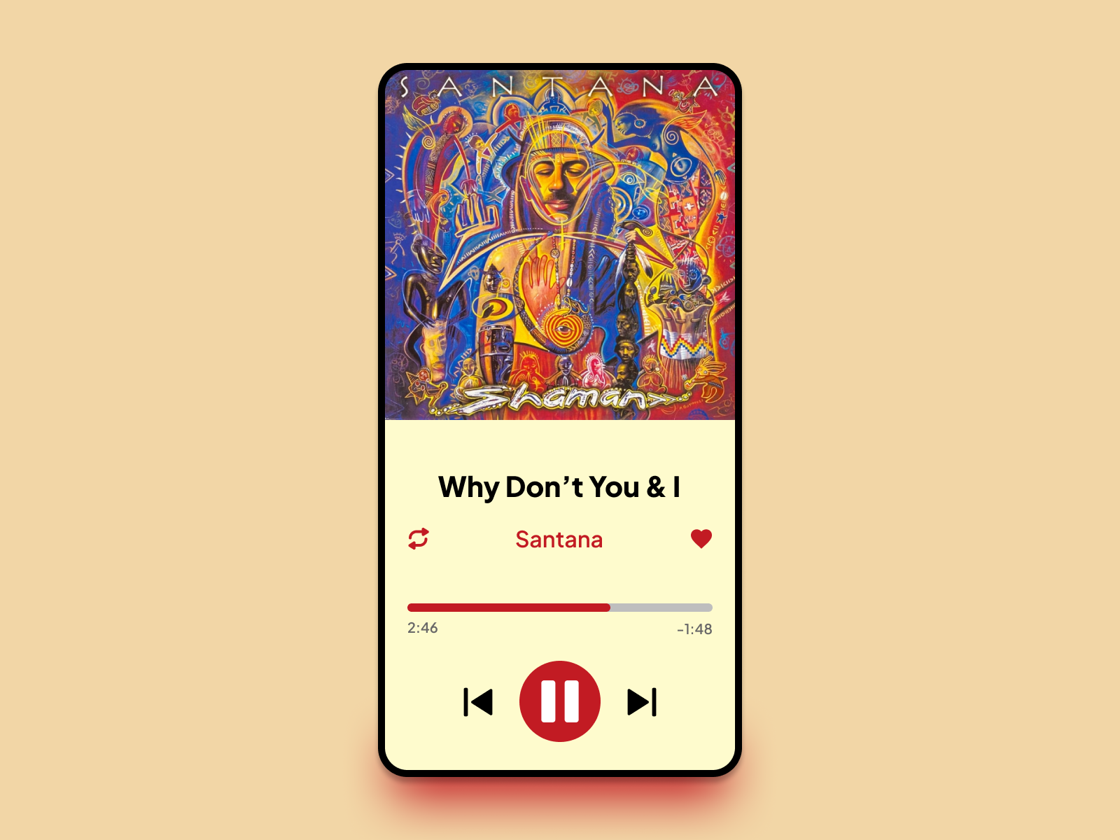
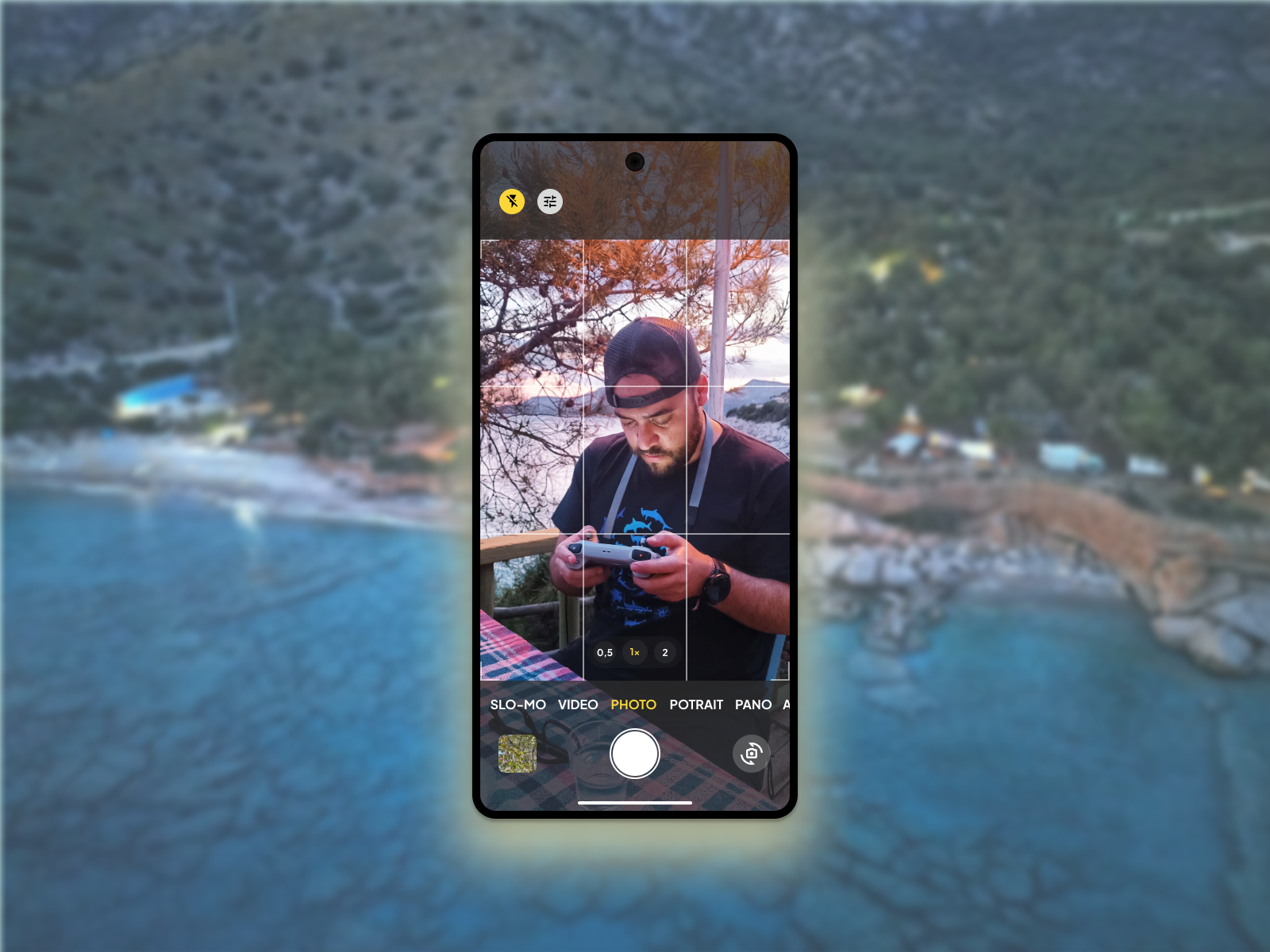
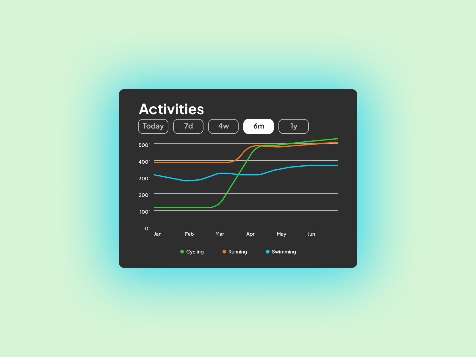
High-Fidelity UI Designs
Drawing from the sticker sheet, I developed multiple designs, each showcasing a sample of the footer menu screen.
High-Fidelity Prototype
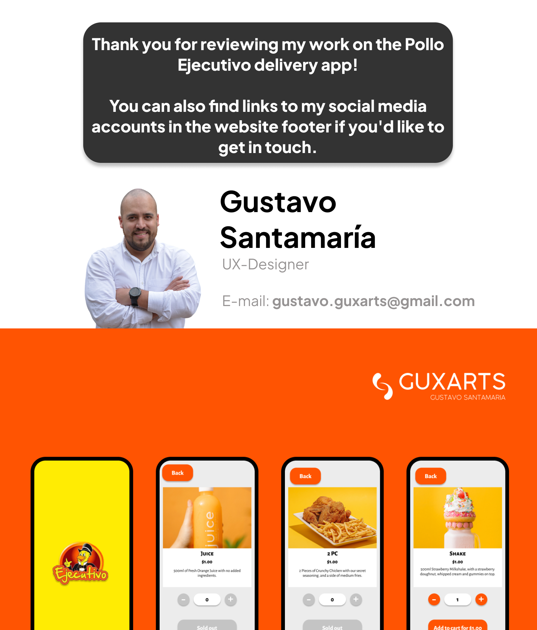
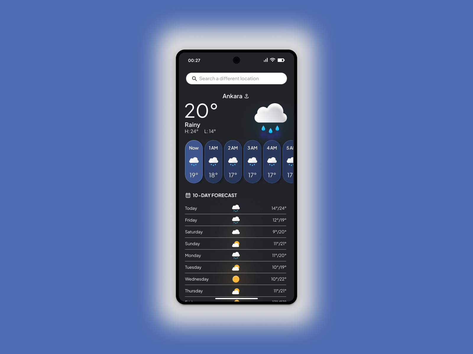
I’m thrilled to unveil the complete high-fidelity prototype, boasting an extensive collection of 50 meticulously crafted screen designs that offer a comprehensive glimpse into the app’s user experience journey.
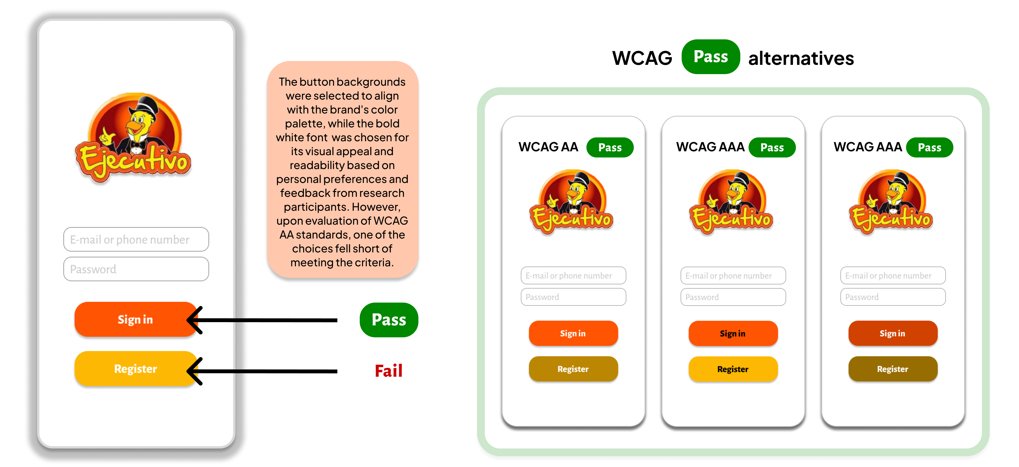
Accessibility
This app has been evaluated for contrast to meet AA standards of WCAG. In some cases, the contrast can be improved.
This was my first case study for the Google UX Professional Certificate. I began with a screener survey, which, while not a project requirement, proved insightful for recruiting suitable candidates for user research and understanding local market dynamics. Notably, the need for an app for Pollo Ejecutivo, a popular local fast-food chain, underscored a significant market gap.
Takeaways
Throughout the design process and subsequent refinements, I encountered a key realization: what I considered the ideal balance between functionality and aesthetics sometimes wasn’t aligned with user preferences and needs. This insight emphasized prioritizing user-centric design principles to create solutions that meet users’ needs and expectations.
Next Steps
For the next steps of this project, I plan to conduct further usability testing with the high-fidelity prototype to gather additional feedback and refine the design based on user insights. As a designer, I aim to continue honing my skills by seeking diverse projects and collaborating with interdisciplinary teams to create impactful, user-centered solutions that address real-world challenges.
Check out my other UX projects
Skyvo
App for career exploration, streamlining vocational guidance for users.