Case Study: Dog Park Cumbayá
Seamless booking for your furry friend's fun-filled adventures.
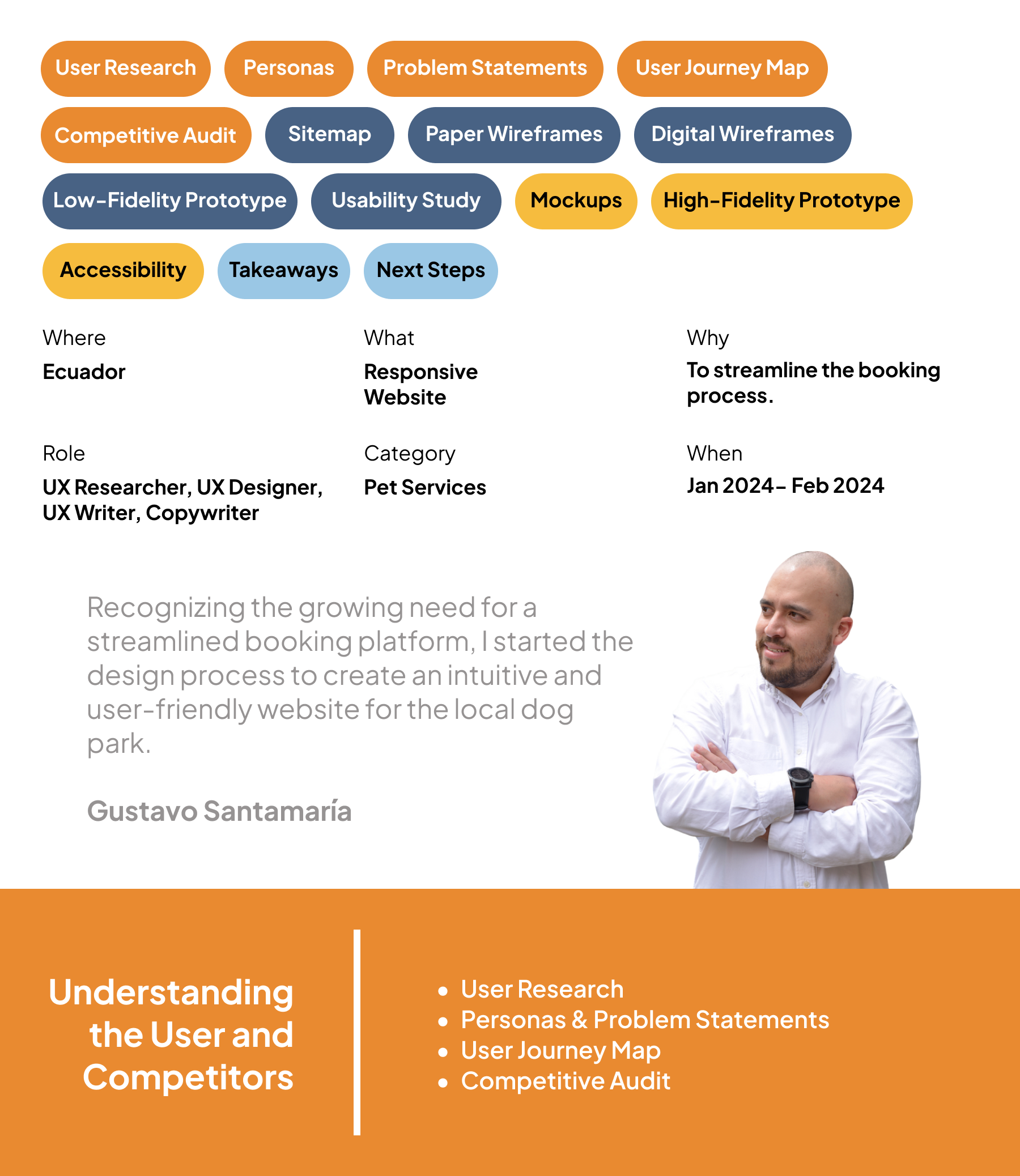
User Research
Summary
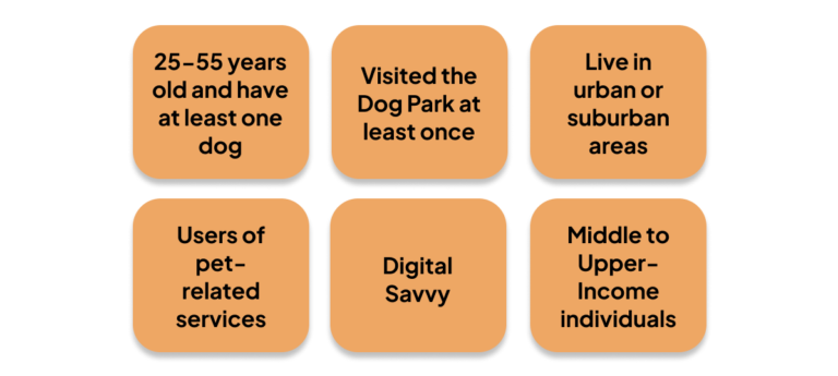
Recruiting participants who had visited Dog Park Cumbayá at least once was a prerequisite. Through targeted outreach on social media, I recruited suitable participants and facilitated the interview process with structured scripts and consent procedures.
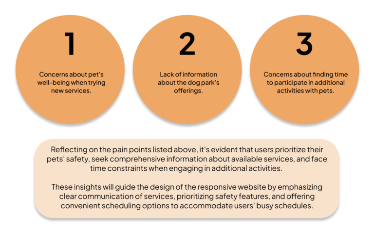
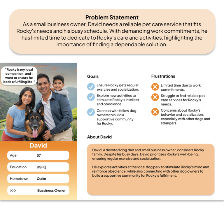
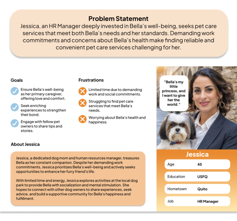
By immersing myself in recorded interviews, I cultivated empathy, built rapport, and gleaned valuable insights to inform subsequent design decisions. I meticulously analyzed the data post-interview, creating empathy maps and distilling key pain points to craft two distinct personas representing diverse user demographics.
These personas were the cornerstone for shaping the user experience and guiding the iterative design process towards a user-centric solution.
User Interview: Participants
Pain Points
Personas & Problem Statements
User Journey Map
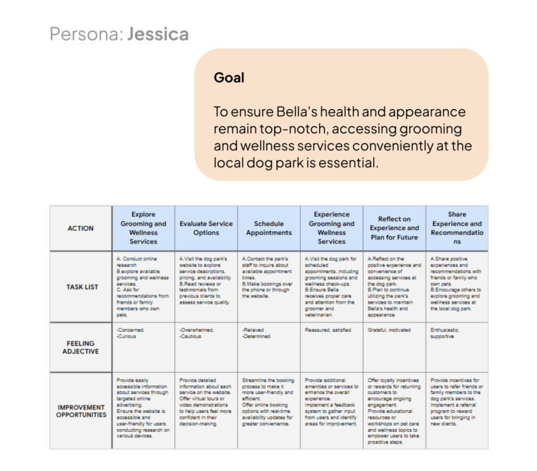
I crafted user journey maps for Jessica and David, emphasizing Jessica’s alignment with current offerings and potential improvements while noting David’s focus on dog training as a future service expansion opportunity not currently provided by the dog park.
Competitive Audit
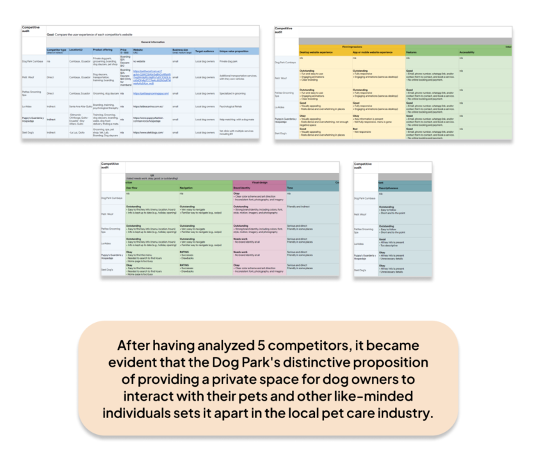
In conducting a competitive analysis for the dog park, I thoroughly examined the websites, services, and pricing models of various pet care establishments. Each competitor offered services, including grooming, boarding, training, veterinary care, product sales, and pet transportation options.
However, the Dog Park was a unique offering of a private space where dog owners could freely interact with their pets and engage with like-minded dog owners in a social setting, a feature notably absent from competitors’ offerings.

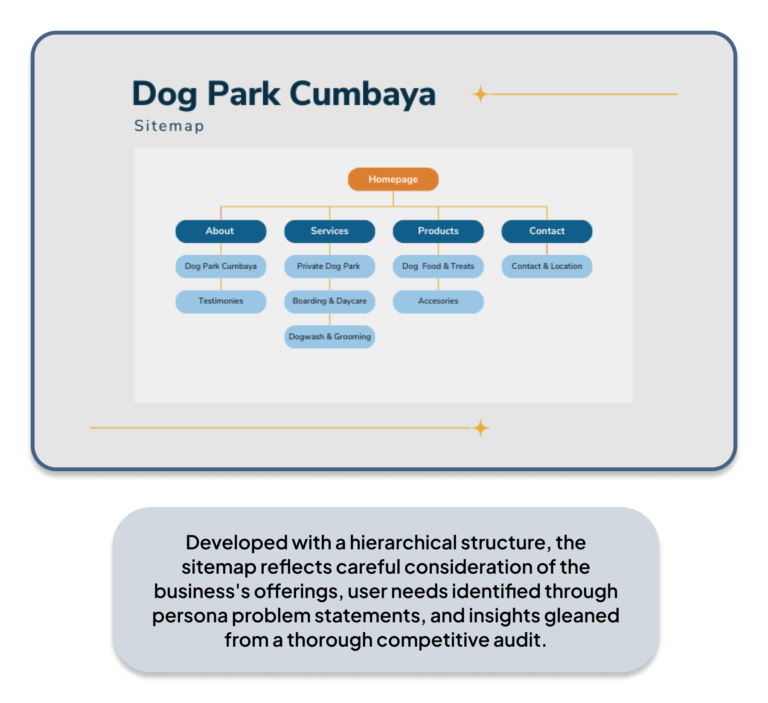
Sitemap
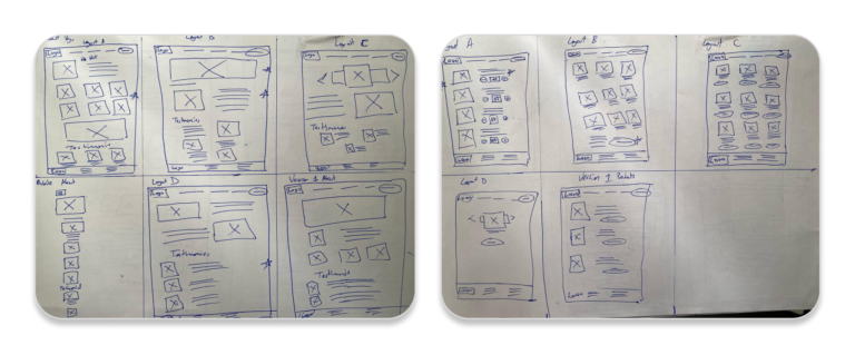
Paper Wireframes
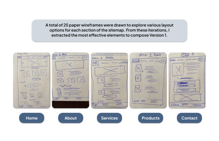
Exploring versatility, I created five layout options for each sitemap section, drawing inspiration from various website layouts, such as single-column, multi-column, box layout, featured image layout, F-layout, Z-layout, and grid cards. I extracted the most effective elements from these and combined them to form Version 1, optimizing the design for enhanced user engagement and clarity.
Experimenting with Layouts
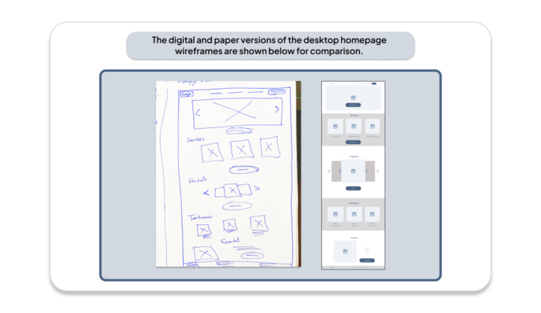
Desktop Version
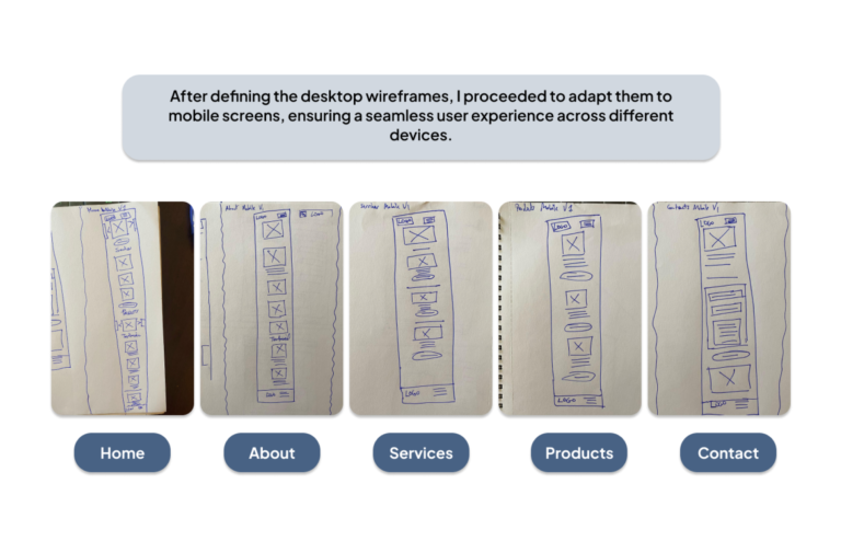
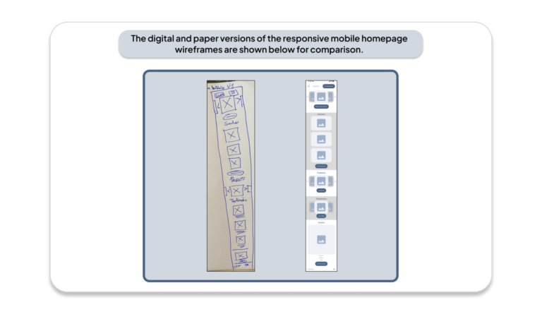
Responsive: Mobile Version 1
Digital Wireframes
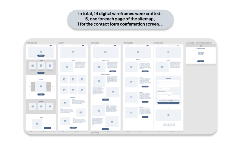
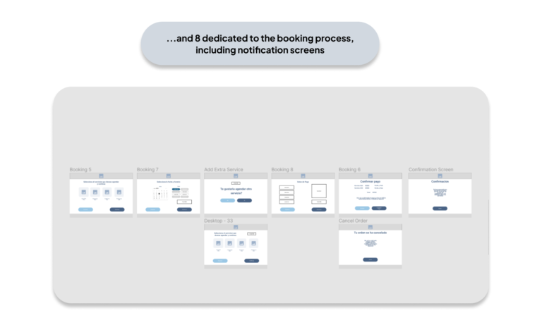
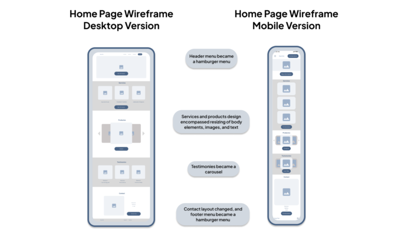
Using Figma, I transformed the paper wireframes into digital versions for desktop screens. Each element was recreated to match the paper layout, ensuring frame consistency. The desktop home screen was also redesigned and resized for the responsive mobile version.
Responsive: Mobile
Desktop Version compared to Mobile Version
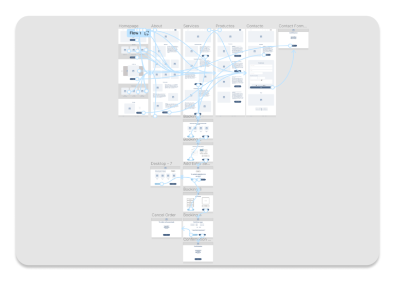
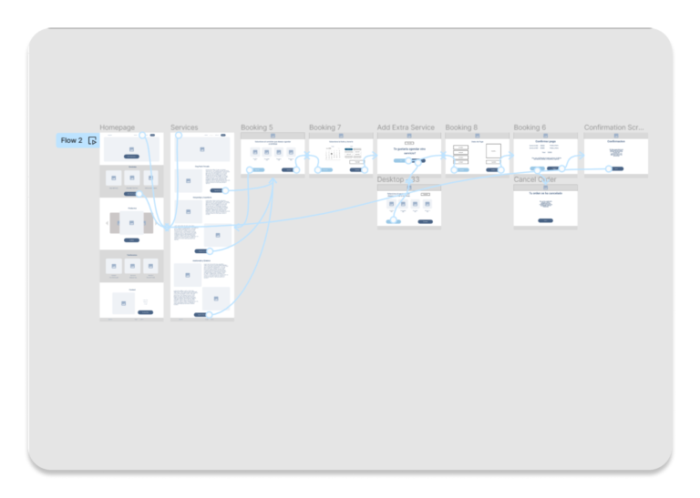
Low-Fidelity Prototype
The low-fidelity prototype for the dog park website showcases early design concepts and functionality. Users can easily browse services, book appointments, and confirm their bookings. It provides a foundation for future development, allowing stakeholders to visualize the site’s structure and suggest improvements.


Usability Study
Summary
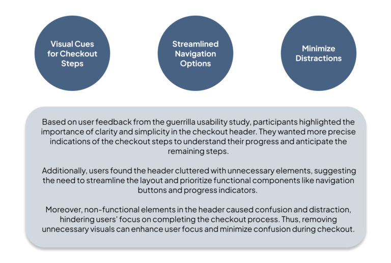
I conducted a guerrilla usability study with three friends who were familiar with dogs. One couple owned dogs, while the other individual was passionate about dogs.
Each participant was given two tasks: first, to explore the various pages of the website, and second, to return to the homepage and book a service.
Parameters

Insights

Mockups
Sticker Sheet
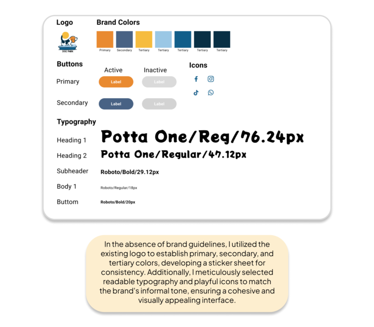
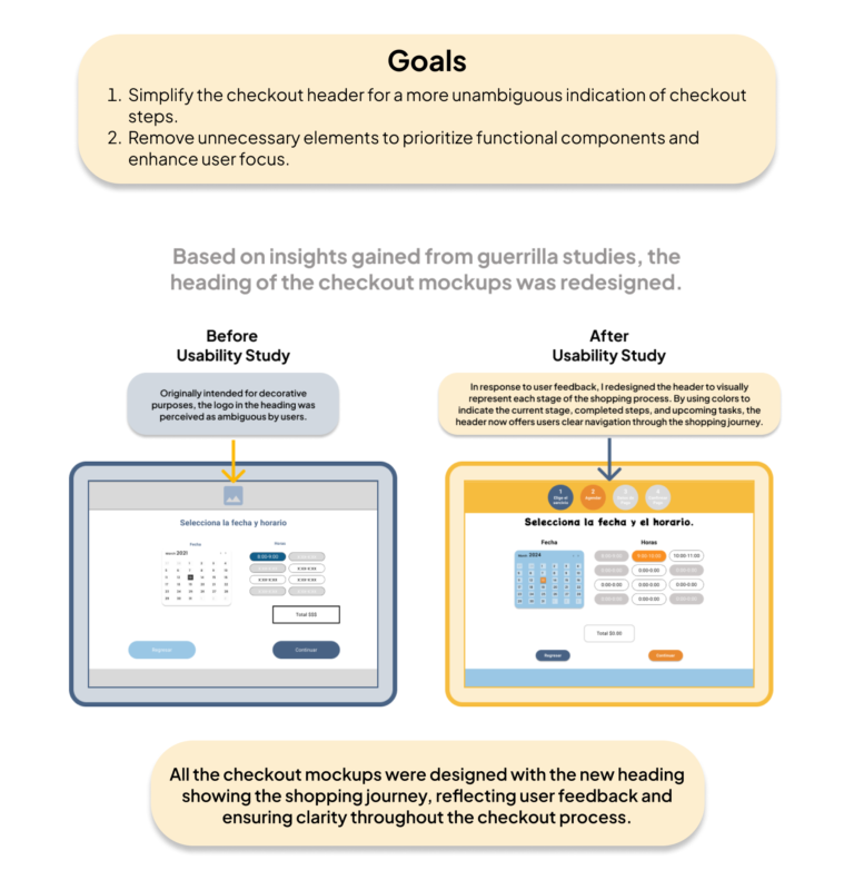
Before designing the high-fidelity prototypes with refinement from the participant insights, I developed a sticker sheet from the brand logo to aid in establishing the design’s visual identity. This process helped ensure consistency and coherence across all screens in the high-fidelity prototype.
Mockups
Mockups: Original Screen Size
Mockups: Screen Size Variation
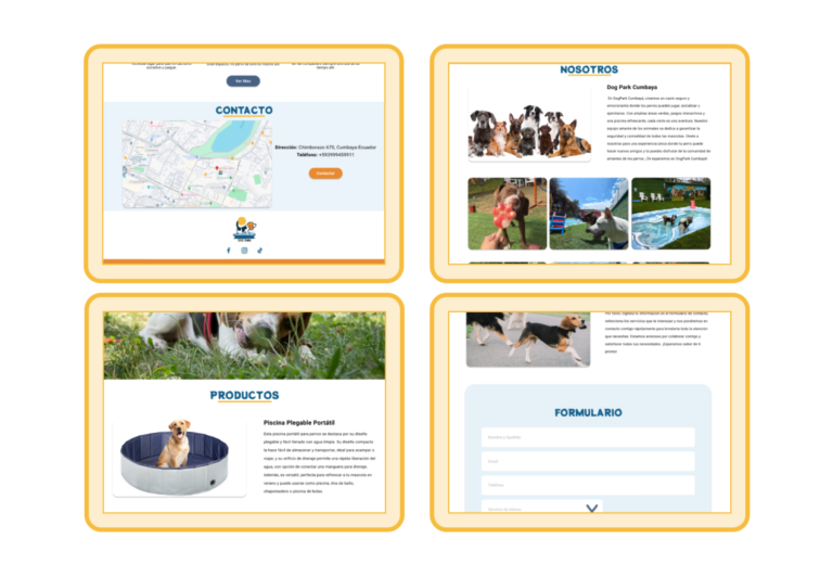
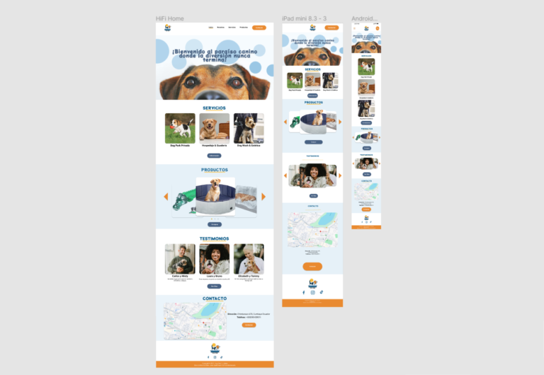
I integrated adjustments for various screen sizes into my mockups, building upon the wireframes created earlier. Recognizing that users access the platform from diverse devices, I prioritized optimizing the browsing experience across different screen sizes, including mobile and tablet, to ensure seamless customer usability.
High-Fidelity Prototype


Accessibility

In my second case study for the Google UX Professional Certificate, I focused on designing a responsive website for a private dog park. Unlike my previous project, I didn’t conduct a screener survey this time. Instead, I recruited participants who had visited the dog park through the dog park’s social media.
Takeaways
Next Steps
Check out my other UX projects
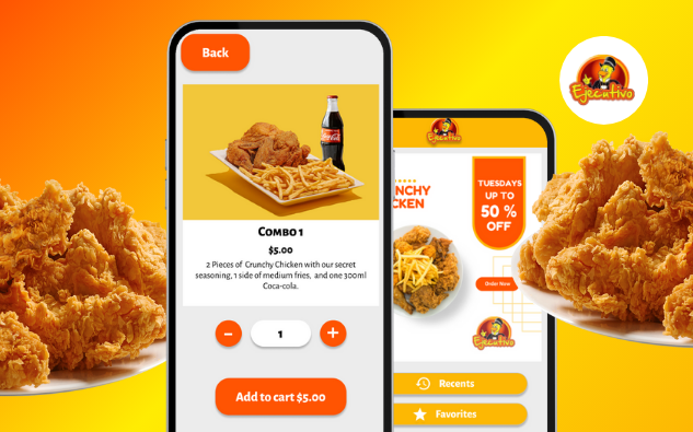
Pollo Ejecutivo
Mobile app prototype for a popular fried chicken chain with 15+ restaurants.

